Make line plot
make_line_plot.RdGenerate the line and ribbon plot for the dashboard.
Details
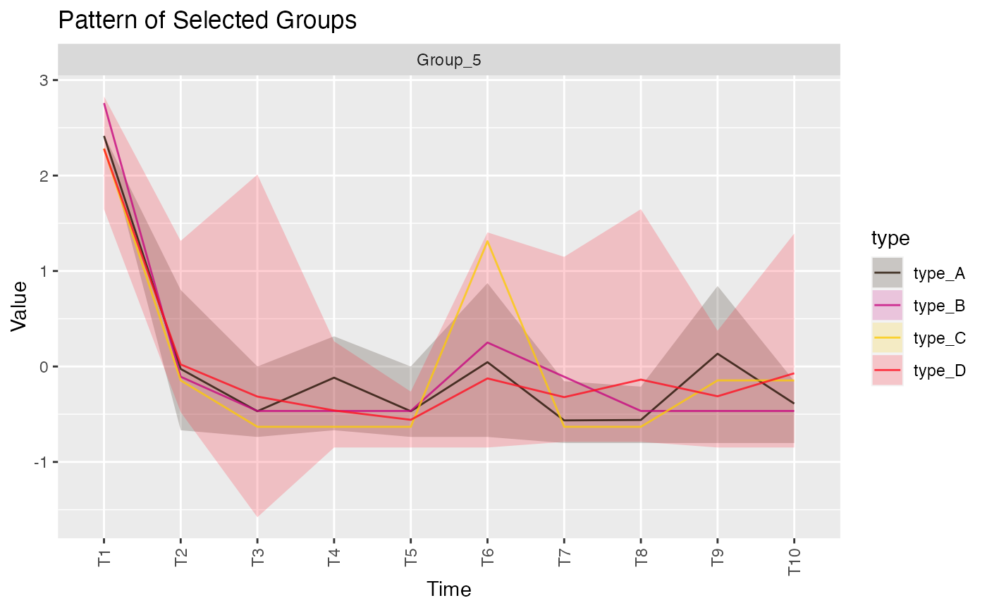
this function makes a ribbon plot for every brush action in the Shiny to show the min, max, and mean value of each clustered pattern group across time. The ribbon plot is grouped and colored by the type variable in input datasets.
See also ggplot2::geom_ribbon.
